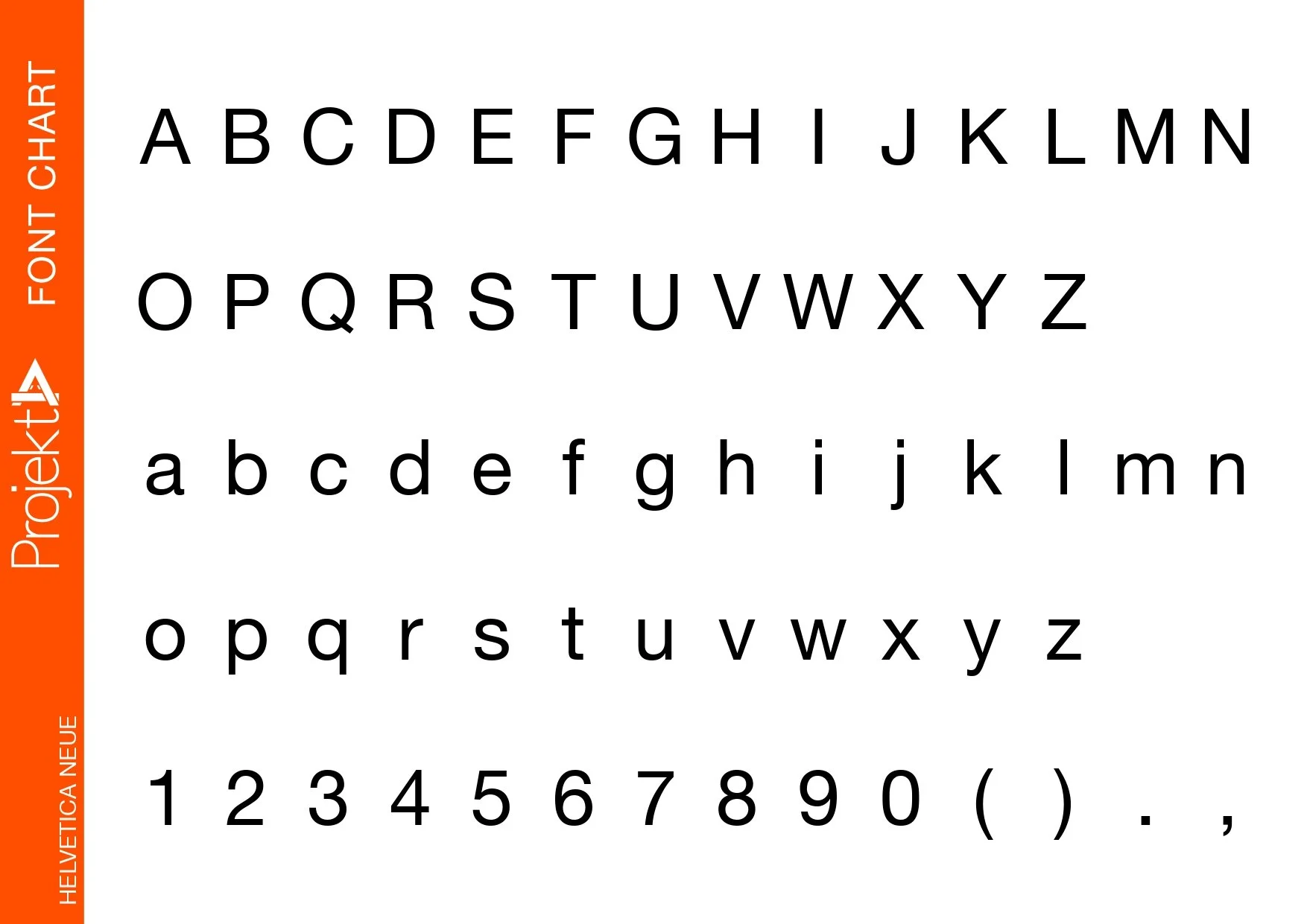
Helvetica Neue font
About this font.
Thanks to Stempel and Linotype's marketing approach, this typeface, developed by Max Miedinger and other project members at the Haas'sche Schriftgiesserei, has become one of the most renowned and popular types in the world. It's built into a lot of printers and operating systems. For the Linotype system, Helvetica's initial letterforms had to be adjusted. Helvetica was developed throughout time to accommodate a variety of weights, but they were not synchronized with one another.
The ‘Helvetica Neue’ typeface was revised and digitized for Linotype in 1983, and it became a self-contained font family. This font family now has 51 distinct font weights.
The Univers font's numbering system was used to create the initial numbering system for the weight classifications. The ‘Helvetica Roman’ font-weight is the foundation of this numeral system. The centre point is the marking ‘55 roman’. The stroke thickness is described by the first figure of the number: 25 ultralight to 95 very black. The width and orientation of the typeface are shown in the second figure: Helvetica 53 expanded to Helvetica 57 condensed.
In terms of shape and quantity of permutations, Helvetica Neue establishes new benchmarks. It's the ideal sans serif typeface, ageless and neutral, and suitable for a wide range of applications.
Designers: Max Miedinger, Edouard Hoffmann
Publisher: Linotype
Thank you for taking the time to interact with this font. Hopefully, this has provided you with insight to assist you with your business.

